Club de Madrid is defined as the world’s largest forum of democratic former Presidents and Prime Ministers. It is precisely from the word forum that the idea for the initial icon arises, a key element to creating a new graphic identity that remains in line with Club de Madrid’s previous image. As part of Club de Madrid’s raison d’être, the logo is the most representative element of the brand, which is built upon it.
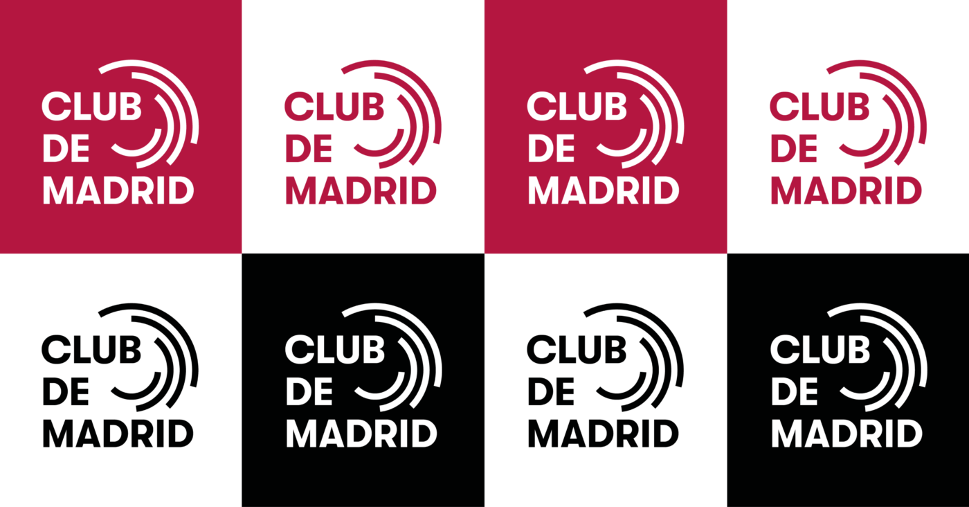
The logo is made up of two clearly differentiated parts: an icon and a typographic element or logotype.
Club de Madrid’s new identity has stylised the icon by making the rings longer, more equidistant, and distributing the weight between them equivalently. With these changes, the obtained form is much more legible and modern, closer to the architectural definition of a forum.

Thanks to all the “New Thinking Officers” of our communications partner Apple Tree Communications for their amazing work on rebranding Club de Madrid.

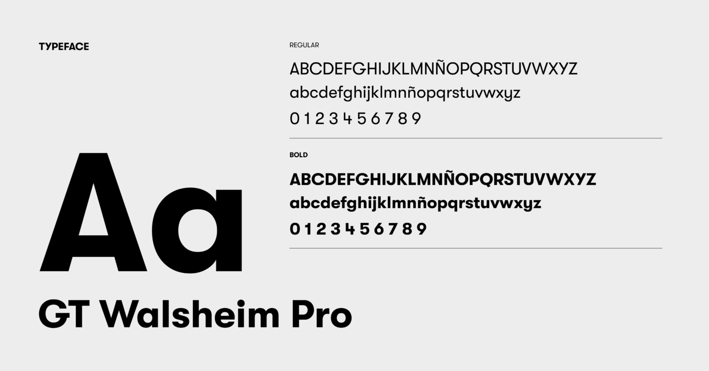
The new logotype features a more modern font in order to humanize the brand and provide dynamism to it. This font is geometric and has the same thickness as the rings, so it creates a link between the icon and the logotype.

As a whole, the logo creates a square that can be visually recognised. Unlike the previous logo, the new one creates harmony and simplicity, which favours compositions around it.
Interested in more? Below you can download Club de Madrid’s Brand Book.

Related Links
Club de Madrid commemorates 20 years strengthening democracy around the globe
