Club de Madrid is defined as a forum of democratic former Presidents and Prime Ministers. It is precisely from the word forum that the idea for the initial icon arises, a key element to create a new graphic identity that remains in line with Club de Madrid’s previous image.
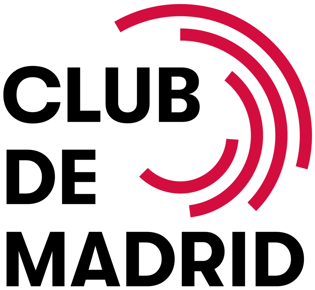
The logo of Club de Madrid is the most representative element of the brand, which is built upon it. Club de Madrid’s new identity has stylised the icon by making the rings longer, more equidistant, and distributing the weight between them equivalently. With these changes, the obtained form is much more legible and modern, closer to the architectural definition of a forum.
Download resources below
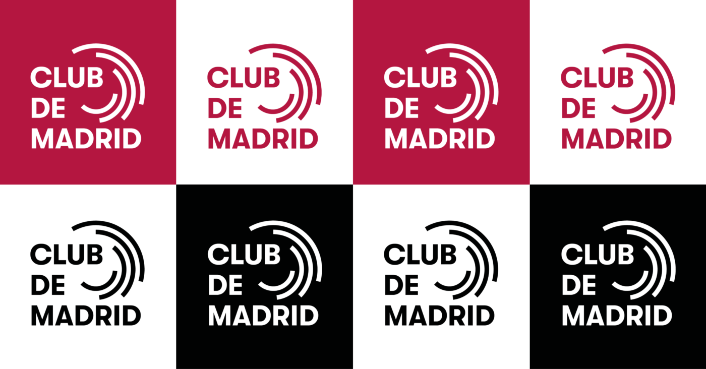
Monochromatic versions. The use of the monochromatic versions of the logo shall be determined by its legibility; that is to say, every time the logo is placed over photography or over colour backgrounds from Club de Madrid’s colour palette. For white backgrounds, the duotone main logo shall always be preferred. Download resources below.
Main palette
The main palette is made up of black and maroon, the latter being the main colour to always be used in both the logo and corporate communications. The decision to keep the maroon tone as the main colour of the brand creates an evolutionary and continuist link with the previous image of Club de Madrid. However, it has been slightly altered for this rebranding, creating a much more vibrant tone, closer to the primary colour magenta.
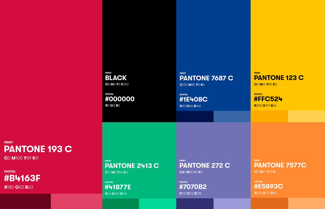
For further details, please consult Club de Madrid’s Brand Book.
For printing or other digital uses, please use the printing and digital logo packages.
For more information, please contact:

